Cost per pound KPI (TMS based Arden ) (solution)
From UG
Info
Solution version 1
CT2 provides special reporting for Arden Trucking Project by using set of Key Performance Indicators (KPI).
"Cost per pound" as KPI belongs to "Cost and Value" family of KPIs.
In CT2 "Cost per pound" KPI presented as external Dashboard Report (DR) and works with using of Concepts for Dashboard Reports.
Calculations
Cost per pound for load = (total cost of load) / (total weight of load in pounds)
Examples:

Monthly Avg Cost Per pound:
Average Estimated Cost Per Pound for Arden Domestic Trucking Operation in November =
Total cost of all loads handled & delivered in November / total weight of these loads

Monthly Avg Cost Per Pound by Carrier:
Average Estimated Cost Per Pound of YRC in November =
Cost of all loads handled & delivered in November by YRC / total weight of these loads

Avg Cost Per Pound by day X:
Day X = Cost of all loads delivered on day X / total weight of these loads
All needed weights, costs and other related info taken from Load Plan that Descartes sends to CT2.
- Dates of receipt of Load Plans into the system are used for calculations as the date when load was handled.
Settings
Visibility
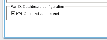
Visibility of "Cost and value" dashboard panel can be switched on/off for each Non-Jaguar User. For this is used "Part D. Dashboard configuration" section in Admin part of system.
Options
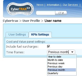
There are two custom options of "Cost per pound KPI" and they can be selected by the user in "My Profyle" section on "KPI settings" tab.
- Include fuel surcharges. There is option for users to include or to exclude the fuel surcharge in the cost per LB.
- Time frames. An option for the user to be able change the time range on which is based calculation of cost per LB.
- Possible values:
- Year to Date
- Month to Date
- Previous Week
- Previous Day
- Previous Month
- Quarterly
How it works
As well as any other DR, Cost per pound KPI has several levels of reporting - from minimal info on dashboard level to more finite details (down to the load / CT details).
User is able interactively drill down the report for each level to next level if it provided.
Level 1. Dashboard report
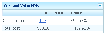
This type of report is "Cost and Value KPIs" table that is located in KPIs section of Client Application.
It contains basic info about current KPI and consists of 3 columns:
- KPI. Contains KPI name - in this case it is "Cost per pound".
- Time frame. Contains calculated value of Cost per pound per specified time frame. Displayed value is the link to the Level 2 of report.
- User can select time frame from provided list of values (see details in Options).
- Name of selected time frame displays in column heading.
- Change. Contains percentage change of Cost per pound per specified time frame compared to the same previous period.
Formula for Change column: ((data)/(previous data) - 1)*100%:
- data: data from time period defined in profile.
- previous data - data from previous same period (defined in user profile).
NOTE: Last line of report shows total costs per selected time frame and percentage change of total cost compared to the same previous period.
Level 2. KPI as a function of time
Level 2 of Dashboard report becomes available after clicking the "Cost per pound" link in the table on Level 1.
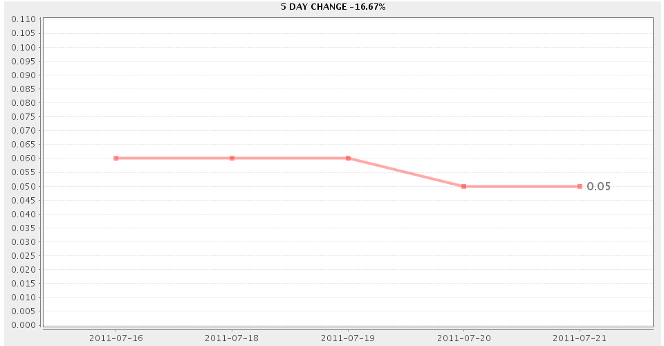
It displays extended "Cost per pound" info and presented as two-dimensional chart.
- Axis Y of chart (vertical) is always Cost per pound.
- Axis X of chart (horizontal) can reflect following reporting options: Time, Carrier, Shipper, Consignee.
In depending of selected parameters, clicking on chart will be open appropriate information window of Level 3.
Parameters
- Type of chart is controlled by "Report Type:" radio group and can take the follows form:
- line - chart which displays information as a series of data points connected by straight line segments.
- bar - chart with horizontal rectangular bars with lengths proportional to the values that they represent.
- pie - circular chart divided into sectors, illustrating proportion. NOTE: is not used when Axis X is Time.
- Time range for report of Level 2 controlled by "Time Period:" radio group and can be one from following values: 1 day, 5 days, 1 month, 3 months, 6 months, 1 year.
Filters
All reports contain a standard set of filters. Now there are:
- P.O. contains:
- SKU contains:
- Trucker:
- Approved Date:
- Pick Up Date:
- Routed Date:
- Delivery Date:
NOTE: all filters are CT-specific (not Load).
Level 3. Load/CT details
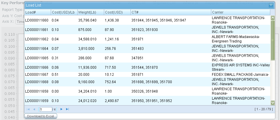
Cost per pound KPI on Level 3 is a table in new modal window that is opened after clicking on the chart on Level 2. Header of window includes caption "Load List" and parameters info from Level 2. Table contains list of selected loads in accordance with these parameters and consists of 6 columns:
- Load#. Number of Load.
- Cost(USD)/Lb. Cost per pound for Load in USD.
- Weight(Lb). Weight of Load in LB.
- Cost(USD). Total cost of Load in USD.
- CT#. List of CTs included in Load.
- Carrier. Carrier of Load.
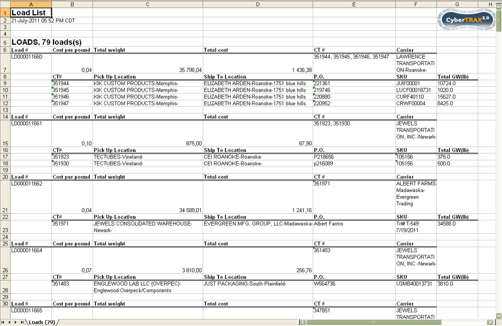
Level 3 has option to download result table onto an excel spreadsheet, when user clicks on "Download to Excel" button.
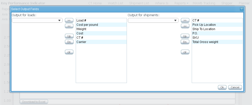
Also system provides choices of columns for output the loads and shipments.
Information in the spreadsheet reflects list of loads with details by belonging shipments.
Solution version 2
Meeting notes
To provide analysis of the Elizabeth Arden Trucking Project that measures "Performance & Cost" according to their current business process.
Time plays a key factor in the cost per lb; it determines how costs vary based upon specific date events for comparison analysis of the cost vs. time. For example, the more time that elapses between when the shipper created the domestic record on the portal, to when that same record’s approved, will make the costs per lb higher, as there was little time to allow for consolidation. Where, the less time that elapses between the shipper’s created record to the planner approval, it would be just the opposite and make the cost per lb lower, as this then allows for consolidation.
- Performance is based upon various date events that occur within the Arden’s supply chain and need to be plotted accordingly in reporting on the cost per lb.
- These “date events” to plot are as follows:
- Created to Approved – how long does a planner prevent the physical transportation of a new and ready to move CT records created by a shipper, to be plotted and planned? If long, this will drive the transportation costs up… This is measured from the Created on Date to the Approved on Date and its relationship to the costs.
- Created to Delivered – this is the “lifecycle” of the shipper’s created record, an over-all transit time, by taking ALL dates into consideration. This is measured from the Created on Date to the Actual Delivery Date, an avg. measuring from the Created on Date, to Approved on Date, to Actual Pickup Date, to Cargo Due Date, to Actual Delivery Date and its relationship to the costs.
- Created to Due Date – how much time does the transportation team have to route the shipment based upon Approved on Date vs. the Cargo Due Date? This is measured from the Created on Date, to the Approved on Date, to the Cargo Due Date and its relationship to the costs.
- Approved to Delivery - this is the “real lifecycle” over-all transit time. This is measured from the Approved on Date to the Actual Delivery Date and its relationship to the costs.
- Approved to Due Date – this is the “theoretical” lifecycle. This is measured from the Approved on Date to the Cargo Due Date and its relationship to the costs.
- Picked Up to Delivered – this is the “physical” over-all transit time. This is measured from the Actual Pickup Date to the Actual Delivery Date and its relationship to the costs.
Now adding filters for contrasting and measuring against the cost per lb.
Filters:
- Trucker (aka Carrier)
- Planner
- Shipper (aka Supplier)
- Consignee
- SKU #
- PO #
Top level reporting is the Cost per lb, with an added level for Transit times, Events, Carriers, Suppliers and Consignees to be used for analysis/comparison against the cost per lb
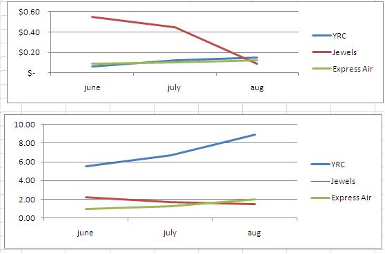
- Transit Times – this is the comparison/analysis of cost vs. time. IE, Picked Up to Delivered (measured in days). Contrasting: Each carrier, Cost compared to Transit Time. Graphical representation of this that includes the cost and times; could be 1 graph or 2 for IE given by Marc:
1 graph for multiple truckers (transit time)
1 graph for multiple truckers (cost per LB)
Both graphs displayed one on top of the other with the same "timeline" so as to make a direct comparison between cost and transit
time.
- Events – this is the comparison/analysis of different ‘event’ time frames between events and relationship to cost. Allowing the user to chose the ‘event’ or ‘event’s’ for comparison/analysis - IE Created to Approved and Approved to Cargo Due Date or Pickup to Delivered and Created to Delivered.; basically all possible date combination comparison/analysis. See KPIs_for_OpsTruck_(concepts_and_requirements)#Average_times_KPI
- Carriers – this is the comparison/analysis of the cost vs. carrier. It’s would be the comparison/analysis of different carriers, against each other and relationship to cost; allowing user to chose the ‘carrier’ or ‘carriers’ to use for comparison/analysis.
- Supplier – this is the comparison/analysis for each supplier cost difference between different suppliers. It’s would be the comparison/analysis of different suppliers, against each other and relationship to cost; allowing user to chose the ‘supplier’ or ‘Suppliers’ to use for comparison/analysis.
- Consignee – this is the comparison/analysis for each consignee cost difference between different consignees. It’s would be the comparison/analysis of different consignees, against each other and relationship to cost; allowing user to chose the ‘consignee’ or ‘consignees’ to use for comparison/analysis.
Again adding filters for further drilling down of the information for contrasting and measuring:
Filters:
- Trucker (aka Carrier)
- Planner
- Shipper (aka Supplier)
- Consignee
- Specific SKU #
- Specific Purchase Order #
List of changes
Look and feel list
Change:
- Do not repeat the days/dates on Axis Y, only list it once and have the Day name value instead of date value
- For IE Monday, Tuesday, Wednesday, Thursday, Friday - no need to include Sat & Sun
- List only 1 value for the cost per lb per day
Phase 1. Carrier vs Cost
- Ability to add carriers, on the fly, for comparison - IE - see #Figure_1 which is from Marc's excel file, also attached to Mantis
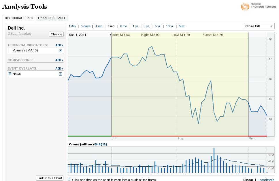
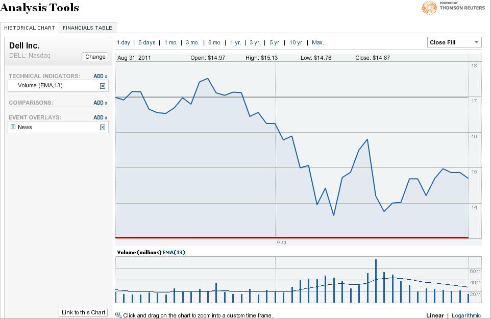
- Drilling down within the full results to get more specific information - IE see #Figure_2, this is from the NY times sites, analysis tools
- Ability for user to select "plots" on the screen for reporting - IE see #Figure_3
Phase 2. of Carrier vs Cost
Figure 1
Figure 2
Full results:
Drilled Down results:
History
Original spec
See KPIs_for_OpsTruck#Cost_per_pound_KPI
