AN ORIGINAL KPIs for OpsTruck (concepts and requirements)
From UG
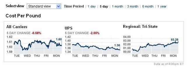
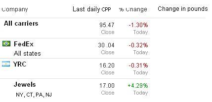
(→Daily change per company plot) |
(→Rewrite based on feedback from Simon and Marc) |
||
| Line 233: | Line 233: | ||
See [[Maps]] | See [[Maps]] | ||
| + | |||
| + | == APPENDIX More ideas == | ||
| + | |||
| + | === Daily change per company plot === | ||
| + | [[File:Daily change per company.JPG]] | ||
Revision as of 15:02, 19 April 2011
Contents |
Info
Related mantis:
- 0002896: [Truck Optimization/KPIs] ...... <proj>
- 0002489: [KPI] (External KPIs) Implement phase 1
Glossary
Requirements
Core need
It is to provide KPI and Supply Chain Geography reporting for Arden Trucking Project.
List of KPIs
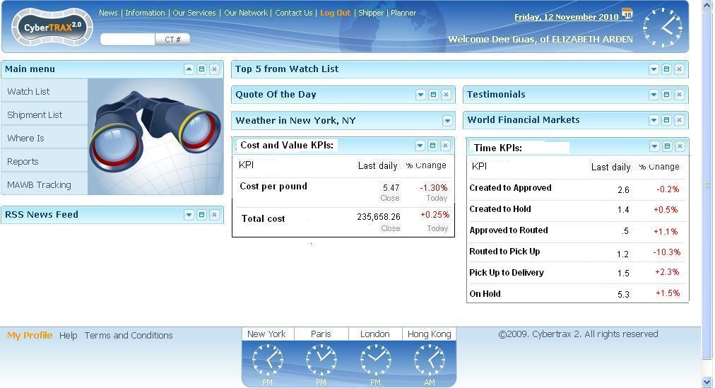
- Cost and Value KPIs:
- Cost per pound
- Total cost
- Value on Hold
- Time KPIs:
- Created to Approved
- Created to Hold
- Approved to Routed
- Routed to Pick Up
- Pick up to Delivery
- On hold
General Design Concepts for Dashboard Reports
Please note that information in this section represents just ideas. At the programming stage this design could be used or/and (partially) replaced with a better design.
Multiple levels. Reporting for each KPI should have several levels. User should be presented with a KPI on a dashboard level (minimal info) and be able to drill down to more finite details (down to the load / CT details).
Standardization. For every KPI approach to UI design should be similar in principle and as standard as possible.
Report types. For every KPI provide the following report types:
- dashboard version (Level 1)
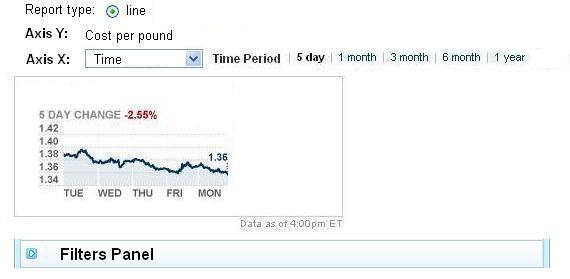
- KPI as a function of time (Level 2)
- KPI as a function of various variables such as CT fields; for example: Carrier, Shipper, Origin State, etc (Level 2)
- line / bar / pie versions
Interactivity. Level 2 reports should be interactive. For example if user clicks the bar representing cost of UPS on Level 2 report then system should take user to Level 3 where he will see only UPS loads.
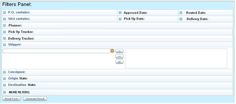
Filters (Level 2 and 3). Provide set of standard filters. Ideally every CT field should be represented by a filter. Use multiselect filters where appropriate.
Level 3 (Load and CT level) report. For this type of report (ideally):
- columns should cover all CT fields
- user should be able to manage order of columns and what columns are included and what are excluded
- provide "HTML version" with standard paging, sort, search capabilities
- provide export to excel feature
Personalization. Some settings should be configured in a user or / and Client profile. Examples:
- some users might want to see year-to-date cost on a dashboard and some month-to-date cost and some daily cost.
- not all users would want to see all dashboards (controlled by user or admin )
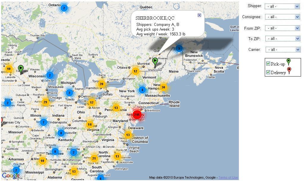
Supply Chain Geography. This should be a Google type interactive map with the following capabilities:
- show pick up locations with Cost Per Pound and Total Cost KPIs info for each individual location
- show delivery locations with Cost Per Pound and Total Cost KPIs info for each individual location
- show pick up/delivery clusters with number of locations/loads in a cluster
- map should have a set of standard Filters
- zoom in/out feature
- ability to set an "abstract" look and feel (only major cities / state borders should be on the map, no other details)
- ability to see both number of locations and number of loads for every cluster on the map at the same time
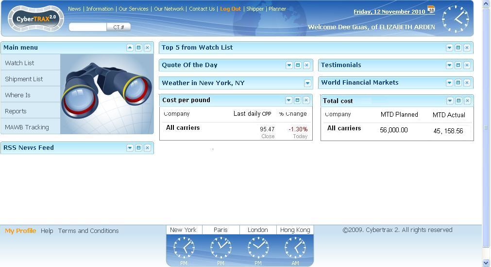
Example of Level 1: Dashboard
If user clicks on any number on dashboard system will take it to the Level 2
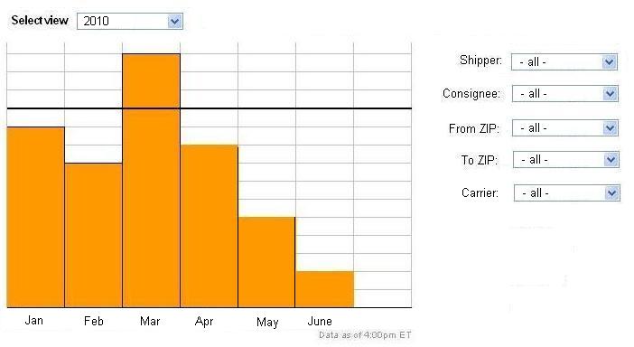
Example of Level 2: Axis X is time
If user clicks on any specific area of the plot then system will take user to the Level 3 and display information related to that area.
Example of Filters Panel
All reports will contain a standard set of filters - see below.
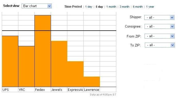
Example of Level 2: Axis X is Selected Carriers and Report type is Bar Chart
If user clicks on any specific area of the plot then system will take user to the Level 3 and display information related to that area. For example if user clicks on UPS bar then on Level 3 we will see only UPS loads.
Example of Level 3: Load and CT level
Requirements for Specific KPIs
Cost per pound KPI
Cost per pond for load = (cost of load) / (weight of load in pounds)
Average Estimated Cost Per Pound of Arden Domestic Trucking Operation in November
   = Cost of all loads handled in November / total weight of these loads
Average Estimated Cost Per Pound of YRC in November
   = Cost of all loads handled in November by YRC / total weight of these loads
Cost Per Pound for day X
  = Cost of all loads delivered on day X / total weight of these loads
Note about passing loads and cost to CT2 from TMS
Please note that to accommodate these requirements we would need to:
- pull cost and load info from Descartes messages and save into CT2
- add Load class to CT2 with cost field
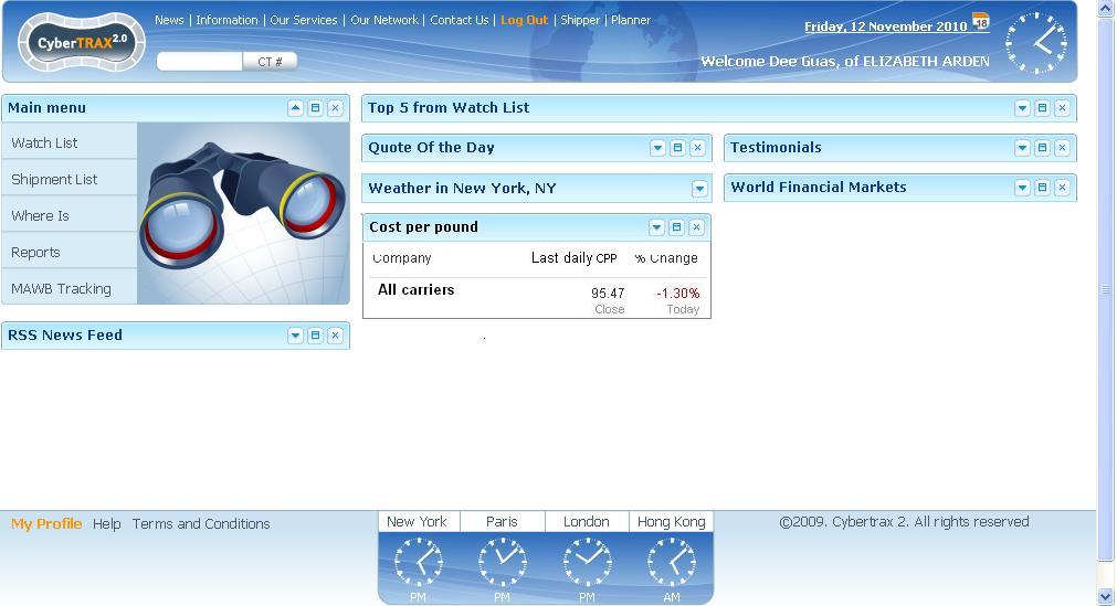
Daily change for all carriers report on a dashboard
Cost per pound change for current week plot
Cost per pound per Carrier
Cost per pound per month
Cost per pound per Load
Average times KPI
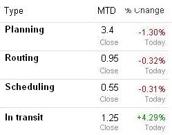
Create reports for analysis of various average times:
- Planning (by Planner)
- Created to approved
- Created to hold
- Routing (by Jaguar)
- approved to routed
- Scheduling (by Carrier)
- routed to pick up
- In transit (by Carrier)
- pick up to delivery
Also
- On hold
- Average time on hold
Formulas and mapping for Time KPIs
All numbers below should have 2 decimals.
KPIs below are measures in time elapsed (in days) between 2 dates in the system.
For dates that may be set and re-set use earliest or lates date - whichever is available in the system. Example: for Created to Hold - measure from created to first/last time on hold.
- Created to Approved
- Created to Hold
- Approved to Routed
- Routed to Pick Up
- Pick up to Delivery
On hold - time elapsed (in days) during which CT has "On hold" status.
Mapping:
- Created - CT#Created On Date
- Approved - CT#Approved On
- Hold
- Routed - timestamp when CT#Pick Up Trucker or CT#Delivery Trucker is set
- Pick Up - CT#Actual Export Pick Up Date
- Delivery - CT#Actual Delivery Date
Avg Times on Dashboard
Plot of an Avg Times change for a current week
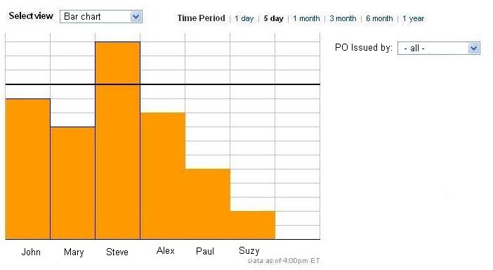
Bar chart of Avg planning time per planner
Total cost KPI
Total cost for day X = Cost of all loads delivered on day X
Total cost on a dashboard
Total cost per Month bar chart
Total cost per Load
Requirements for Supply Chain Geography
To provide visualization tools based on maps.
Examples
Map with statistics per location and clusters
Route for selected load with several stops and defined cost per pound range
History
Original ver
Rewrite based on feedback from Simon and Marc
Links to old designs:
See Average times
See Maps
