Where Is Report
From UG
| Line 74: | Line 74: | ||
tw12) Change the binocular color to Orange to be more outstanding (please ask Slava to design it) | tw12) Change the binocular color to Orange to be more outstanding (please ask Slava to design it) | ||
| + | |||
| + | === Note About Containers === | ||
| + | * see [[Containers_and_Contents_Component#FCL_.2F_LCL_vs_Ocean-Truck]] | ||
| + | |||
| + | === Note about Archived CTs === | ||
| + | They are not included into this Report | ||
| + | |||
== Dev == | == Dev == | ||
Revision as of 22:08, 27 November 2009
Contents |
Major revisions of this doc
- --Alex 17:07, 31 July 2009 (UTC) see post in tw#2
Business Needs and Requirements
Specs
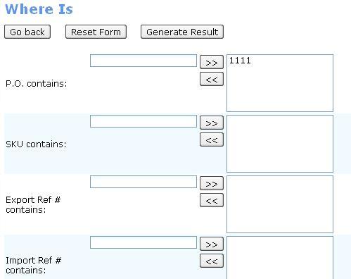
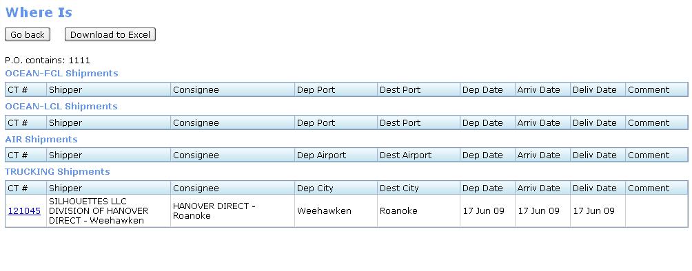
ss1 results in HTML
ss2 results in spreadsheet:
NOTE: There is a similar report for Client App, see here: Client Where Is
Use cases
QA
Look And Feel
RFC
Tweaks (v1.1)
tw1) HTML paging
tw2) Master Airway Bills and container# fields, when user enters number in, it should be tab over automatically for each box. For example, 111-1111-1111 user must be able to enter 11 digits without jump it to each box manually. There are 3 boxes with 3 digits, 4 digits, and 4 digits with automatically tab over when user are typing.
- --Alex 17:06, 31 July 2009 (UTC) new: see Master Airway Bill field
tw3) Logic for the Master Airway right now is not correct.
- If Master Airway Bills field is not empty, show records that are filtered by AIR only. The records for different MOT must not be showing in this case.
- If Container #s: field is not empty, show records that are filtered by Ocean only. The records for different MOT must not be showing in this case.
tw4) Logic for Container #s: and Master Airway Bills, it must be allowed user to choose one at the time. One field must be read only (grey out) when the other field is active.
tw5) When user does not set any filter(s) and click "Generate results", it does not search anything and it must also notify user somehow as 2 options below:
- show an error message somewhere.
- or "Generate result" button must be in a non-active mode or a grey out button.
tw6) On the result page, Deliv Date and Comment columns should be merged and should not be showing both at the same time. See options below:
- grey out one column when the other one is active.
- If Deliv Date column is showed, Comment column must be greyed out or n/a.
- If Comment column is showed, Deliv Date column must be greyed out or n/a.
- OR merge both columns to one column
- show an active column only. For example, when Deliv Date field is active, there is no Comment column or vise versa.
Note: tw1-tw6 -- Tira 05:20 PM 27 July 2009 (UTC)
tw7) --Alex 18:41, 31 July 2009 (UTC) need Jag logo on xls version of report (top right)
tw8) --Alex 18:41, 31 July 2009 (UTC) CBM - need 2 decimals not 3
tw9) Must have logic to control all the dates (high priority) For example:
- Departure Date field logic : from date MUST not be after to date. (chronologically) -- Tira 4:09 PM 4 Aug 2009 (UTC)
- Arrival Date field logic : from date MUST not be after to date. -- --Tira 11:20 PM 4 Aug 2009 (UTC)
Note: tw10) --Tira 2:35 PM 6 Sep 2009 (UTC)
tw10) Where Is Report, Need to have a binoculars in front of the detail record that is searched for.
For Example,
Cybertrax> Where Is> set filter(s)> Generate result.
User can set any filters; In this case I set filter for SKU contain 1111, then click generate result. Then lists of CT# result is generated. Then I want to see CT# 33 detail, I clicks CT# 33 link. Then I view CT#33, I am supposed to see a binocular in front of P.O 123 (because this P.O contains SKU 1111)
Note: tw11)and tw12) --Tira 5:30 PM 2 Oct 2009 (UTC)
tw11) Add a column for binocular(s) itself/themselves in front of P.O column
tw12) Change the binocular color to Orange to be more outstanding (please ask Slava to design it)
Note About Containers
Note about Archived CTs
They are not included into this Report
Dev
Old specs: http://mantis.jaguarfreight.com/svn/ct2/SS/reports/where_is/v2/


