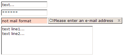
Textbox
From UG
(Difference between revisions)
(→Template) |
|||
| (21 intermediate revisions not shown) | |||
| Line 1: | Line 1: | ||
| - | [[Category: | + | [[Category:Widgets]] |
== Intro == | == Intro == | ||
| - | + | Frequently used UI control. | |
Used to enter text on forms. | Used to enter text on forms. | ||
| - | == Major Attributes == | + | == Major Functional Attributes == |
| + | === datatype/format === | ||
| - | + | See [[Datatypes]]. | |
| - | === | + | === validation === |
| - | + | ||
| - | + | see [[Validation]] | |
| - | + | ||
| - | === | + | === readonly === |
| - | + | ||
| - | === | + | Values: Y, N. |
| - | + | ||
| + | === default === | ||
| + | |||
| + | Values: | ||
| + | * blank | ||
| + | * constant | ||
| + | * value that comes from DB or memory | ||
| + | |||
| + | == Look and Feel attributes == | ||
=== width === | === width === | ||
| - | |||
| - | == | + | Defines how wide is a textbox on the screen. |
| - | + | ||
| + | Most of the times it is defined in number of chars (ZK '''cols''' attribute). But it could be also defined in pixels (ZK '''width''' attribute). | ||
| + | |||
| + | This is actually almost only style / layout issue, could be defined in Style section. So in this case link should be provided instead of repeating definition. | ||
| + | |||
| + | |||
| + | |||
| + | |||
| + | == Template == | ||
| + | |||
| + | :: ''default:'' blank, from DB, etc | ||
| + | :: ''datatype/format/Biz Obj:'' [[Datatypes#TBD]] or link to ''Business Object'' wiki | ||
| - | + | :: ''required:'' N, Y | |
| + | :: ''validation type:'' [[Validation#zk_standard]], [[Validation#on submit]], [[Validation#ststus line]] | ||
| + | :: ''readonly:'' N, Y | ||
| - | + | == See also == | |
| - | + | ||
| - | + | ||
| - | + | ||
| - | + | ||
| - | + | ||
| - | + | ||
| - | + | ||
| - | + | ||
| - | + | ||
| - | + | ||
| - | + | ||
| - | + | ||
| - | + | ||
| - | + | ||
| - | + | ||
| - | + | ||
| - | + | * http://en.wikipedia.org/wiki/Text_box | |
* [http://docs.zkoss.org/wiki/Developer_reference_The_XUL_Components_Components_Textbox In zk ref] | * [http://docs.zkoss.org/wiki/Developer_reference_The_XUL_Components_Components_Textbox In zk ref] | ||
Current revision as of 20:41, 22 February 2010
Contents |
[edit] Intro
Frequently used UI control.
Used to enter text on forms.
[edit] Major Functional Attributes
[edit] datatype/format
See Datatypes.
[edit] validation
see Validation
[edit] readonly
Values: Y, N.
[edit] default
Values:
- blank
- constant
- value that comes from DB or memory
[edit] Look and Feel attributes
[edit] width
Defines how wide is a textbox on the screen.
Most of the times it is defined in number of chars (ZK cols attribute). But it could be also defined in pixels (ZK width attribute).
This is actually almost only style / layout issue, could be defined in Style section. So in this case link should be provided instead of repeating definition.
[edit] Template
- default: blank, from DB, etc
- datatype/format/Biz Obj: Datatypes#TBD or link to Business Object wiki
- required: N, Y
- validation type: Validation#zk_standard, Validation#on submit, Validation#ststus line
- readonly: N, Y


