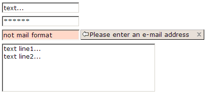
Textbox
From UG
(→Template for spec) |
|||
| Line 7: | Line 7: | ||
Used to enter text on forms. | Used to enter text on forms. | ||
| - | == Major Attributes == | + | == Major Functional Attributes == |
| Line 28: | Line 28: | ||
Possible values: | Possible values: | ||
| - | * | + | * [[stop on max]] - system will not let user enter more than X chars, it will simply silently stop as if we hit the wall |
| - | * zk | + | * [[zk standard]] - typical "real-time" ZK validation - on focus Off bar will appear with "x" |
| - | * on | + | * [[on submit]] - validate only after user clicked "Submit button". Standard Error pop-up will appear. |
| + | * none | ||
| - | |||
| - | |||
| - | |||
| - | |||
| - | |||
| - | |||
| - | |||
| Line 52: | Line 46: | ||
* constant | * constant | ||
* value that comes from DB or memory | * value that comes from DB or memory | ||
| + | |||
| + | == Look and Feel attributes == | ||
| + | |||
| + | === width === | ||
| + | |||
| + | Defines how wide is a textbox on the screen. | ||
| + | |||
| + | Most of the times it is defined in number of chars (ZK '''cols''' attribute). But it could be also defined in pixels (ZK '''width''' attribute). | ||
| + | |||
| + | This is actually almost only style / layout issue, could be defined in Style section. So in this case link should be provided instead of repeating definition. | ||
| + | |||
=== Template for spec === | === Template for spec === | ||
| Line 58: | Line 63: | ||
| '''Attribute:''' || '''Value:''' | | '''Attribute:''' || '''Value:''' | ||
|- | |- | ||
| - | | type/format: || alphanumeric | + | | type/format: || integer / decimal / alphanumeric / ascii |
| - | + | ||
| - | + | ||
| - | + | ||
| - | + | ||
|- | |- | ||
| - | | | + | | validation: || stop on max / zk standard / on submit |
|- | |- | ||
| - | | default: || tbd | + | | default: || blank / tbd |
|- | |- | ||
| + | | read-only: || Y / N | ||
|} | |} | ||
Revision as of 20:15, 21 January 2010
Contents |
Intro
Easily most used UI control.
Used to enter text on forms.
Major Functional Attributes
type/format
Type as in "data type".
This encompasses "constraints". Normally system validates these.
Possible values - see Datatypes.
In ZK there are seperate widgets for some datatypes: "intbox", "decimalbox", etc.
! This could/should be defined often "before" the UI - this is a property of class of corresponding object. So in this case link should be provided instead of repeating definition.
validation
This relates to how / when we validate type/format.
Possible values:
- stop on max - system will not let user enter more than X chars, it will simply silently stop as if we hit the wall
- zk standard - typical "real-time" ZK validation - on focus Off bar will appear with "x"
- on submit - validate only after user clicked "Submit button". Standard Error pop-up will appear.
- none
readonly
Values: Y, N.
default
Values:
- blank
- constant
- value that comes from DB or memory
Look and Feel attributes
width
Defines how wide is a textbox on the screen.
Most of the times it is defined in number of chars (ZK cols attribute). But it could be also defined in pixels (ZK width attribute).
This is actually almost only style / layout issue, could be defined in Style section. So in this case link should be provided instead of repeating definition.
Template for spec
| Attribute: | Value: |
| type/format: | integer / decimal / alphanumeric / ascii |
| validation: | stop on max / zk standard / on submit |
| default: | blank / tbd |
| read-only: | Y / N |


